Under stiff competition from a major Irish airline set about redesigning its website with an internal team and contractors in 2013. Coming to the end of their design process they requested the near-finished site be assessed by Each&Other.
Key facts
- Industry: Aviation
- Position: Account lead
- Team: 1
- Year: 2014-2015
- Tasks: User testing, user & stakeholder interviews, collaborative design workshops, F&B creation
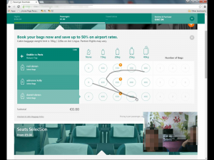
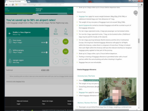
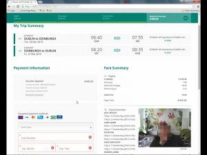
Our assessment found areas that could be improved. The new site focused too much on aesthetics, at the expense of strong user journeys, logical information hierarchy, and clear copy.
Activities
Given that the site was nearing its completion we first worked with the primary stakeholder to understand how the site was being products (an internal UX department and visual designer coordinated a Prague-based external design fulfilment agency, and New Delhi- based development agency). Once these relationships were mapped, we interviewed primary stakeholders to understand their views of the site’s redevelopment, and their hopes for the site post-launch.
After our own internal review of the new site, we conducted a series of user tests with individuals who matched our identified personas (parents, business travellers, lone travelers, large-group travellers). To improve empathy, and to give stakeholders an understanding of customers’ frustrations, client board members were invited to watch each test session (18 sessions were conducted in total).
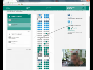
During each session client staff were asked to make notes of significant issues and themes. Affinity diagram sessions were then held at the end of each day. Videos of each user test were shown other board members who were unable to attend.
Findings
User testing revealed a number of significant issues with the new site, most of which resulted from two issues.
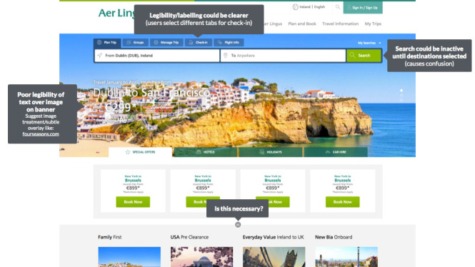
- Customers conflated confusing design with an attempt to add more costs
- The complicated set up to create the site – multiple agencies in different timezones – resulted in no one person or agency taking responsibility for the site. Because of this, the site was over designed, inconsistent, and bloated.
Results
The client made some improvements to the site prior to launch, and are in the process of rolling out other recommendations now.